Forgot to water the plants again? The trash can is overflowing, the EV is empty? And the fridge door keeps getting left open? All while you have that data somewhere in your smart home? I’ll show you in three steps how to easily integrate a display like this into your Home Assistant dashboard so you never miss a warning again:

Prerequisites
For this tip you need to install the card-mod extension from the Home Assistant Community Store (HACS). Just open HACS in the sidebar, search for card-mod in the list of extensions, and click Download twice. Then reload the Home Assistant interface by clicking Reload — and the extension is ready to use.
Customizing the CSS Style
With this extension you can change the appearance of your dashboard elements. For example, to display a red warning card with white text instead of a neutral card, add the following YAML snippet to your card:
|
|
The CSS variables used here (recognizable by the -- prefix) allow you to customize Home Assistant-specific elements such as icons or switch colors without needing in-depth CSS knowledge.
Enabling Conditional Display
Of course the cards should only appear when an actual error or warning is present. Use an entity-filter and define a condition. In this example, the fridge temperature should only be shown when it exceeds 8°C.
|
|
The complete definition looks like this, combining entities with conditions and our card-mod style:
|
|
More Complex Example
You can of course group multiple entities together when they should be displayed in the same color, while still defining independent display conditions for each — like in this example:
|
|
Color Hierarchy and Combined Conditions
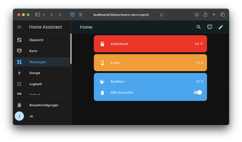
A clear dashboard lives by a strong hierarchy that highlights important information while maintaining readability. I recommend structuring warnings and errors in your Home Assistant dashboard by color:
- Red for critical errors (e.g. fridge temperature too high).
- Orange for warnings (e.g. low battery level).
- Blue for informational notices (e.g. take out the trash).
With this hierarchy you can assess the urgency of a situation at a glance.
Example: Three Groups with Different Warning Levels
Here is an example of a dashboard combining errors, warnings, and notices:
|
|
Hopefully you’ll never miss anything again!
What’s Next
Are you already capturing all the sensor data and information relevant to you in your smart home? What about wind speed? In my article Integrating Wind Meters with ESPHome into Home Assistant I show you how easy it is.
→ In a follow-up video I show four advanced methods for integrating warnings into your dashboard even more elegantly — completely without card-mod: 4 Smart Dashboard Tricks – So You Never Miss Anything Again