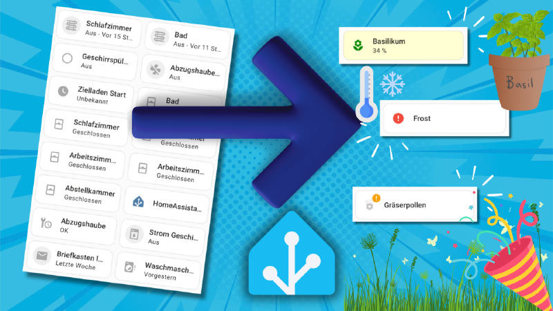
Whether warning symbols, color highlights, or dynamic display: these four ideas take your dashboard to the next level – functional, elegant, and practical for everyday use.

In everyday life it can easily happen that important information gets lost in the smart home dashboard – be it humidity that’s too low, a door left open, or a device that has gone offline. In this post I’ll show you four concrete methods to make sure such information is visually highlighted and no longer overlooked in Home Assistant.
Why Visual Highlighting Matters
Home Assistant offers many automation options, but a lot of potential is wasted when it comes to dashboard presentation. A uniformly grey dashboard lets important alerts fade into the background – with targeted use of colors and symbols you can change that.
Method 1: Colored Backgrounds with CardMod (Static)
With card-mod you can customize the background color of individual cards. This works even without conditions – for example to highlight specific sensors.
Example:
|
|
Method 2: Dynamic Colors via Template and CardMod
A bit more advanced, but very effective: you use a template to automatically choose a color based on the sensor value – for example for humidity or temperature.
Example:
|
|
Method 3: Warning Symbols via “unavailable” Status (Helper Sensor)
A clever trick: Home Assistant displays a yellow warning symbol (⚠️) when a sensor’s status is unavailable. You can use this deliberately – for example with an additional template sensor that only takes on this status under certain conditions.
Example:
|
|
Method 4: Display via binary_sensor with device_class “problem”
If you want a striking red warning symbol, you can use a binary_sensor with device_class: problem. As soon as the state switches to on, Home Assistant automatically shows the symbol.
Example:
|
|
Conclusion
These four methods help you make your dashboard not only nicer, but also more functional and more reliable. In everyday life it’s crucial to see at a glance when something is wrong – and that’s exactly what visual cues like colors, symbols, and status indicators help you with.
Tip: Combine multiple methods – for example a tile with a colored background and a symbol – so you’re guaranteed never to miss anything.
→ I covered the basics of conditional display with card-mod in the first part of this series: Fehler und Warnungen im Home Assistant Dashboard richtig anzeigen
You’ve reached the end of this article. Did I help you out? Did you enjoy the video? I’d be really happy if you thought it was worth €5. You can find more on the About me page.
― Joachim